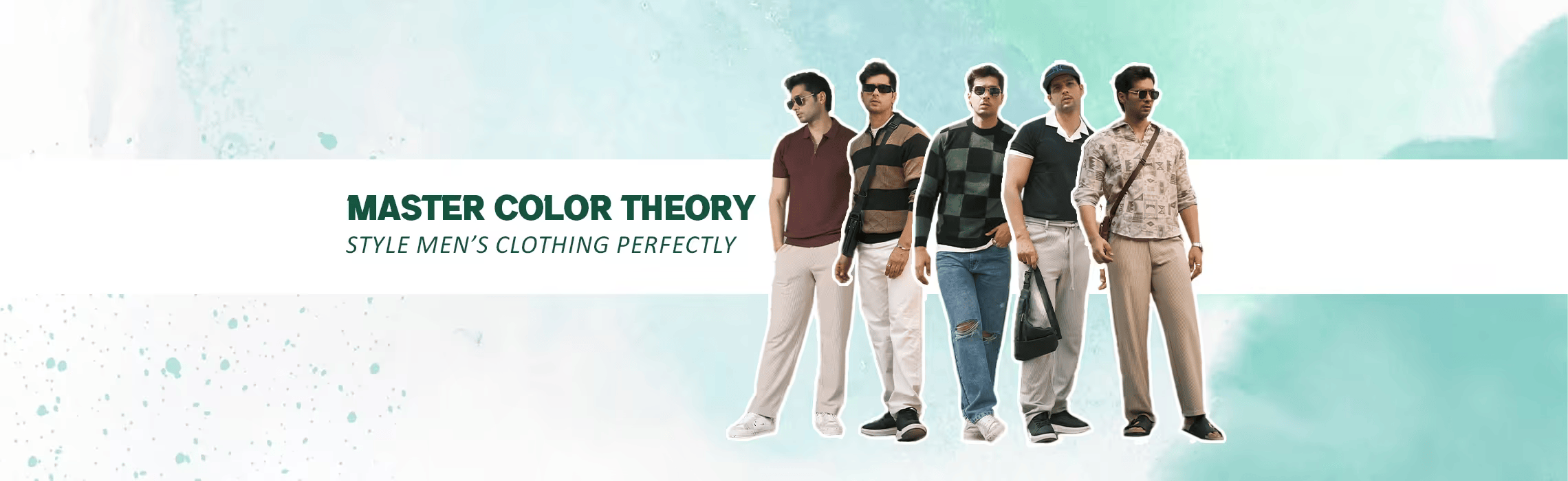
What separates a good outfit from one that turns heads? The answer often lies in the art of outfit color coordination. Colors speak louder than you think. When chosen wisely, they don’t just tie your outfit together—they broadcast confidence, showcase personality, and add the right kind of energy to every room you walk into.
The color wheel, long revered by designers and stylists, is your ultimate guide to mastering outfit combinations. It helps you understand how colors work together. It shows how to pair shades like navy and mustard for a sophisticated vibe or combine red and green for high-contrast energy without overdoing it.
Read this blog to understand the selection process - where we have broken down the wheel’s components as per user’s convenience. You could be going for an office look that demands subtlety or a casual outfit where you want to stand out, the color wheel offers a clear direction to make color combinations feel natural and intentional.
You have scoured the web for fashion tips for men and found your way over here. Let’s begin.
The Basics of the Color Wheel
The color wheel might seem like an artist's tool, but its real magic unfolds when applied to fashion. It’s your cheat sheet to combining colors that grab attention, complement your look, and suit the moment. Understanding the color wheel basics makes pairing your options feel less like guesswork and more like second nature.
#What Is the Color Wheel?
The color wheel is a visual guide to understanding the relationships between colors. It is a circular spectrum divided into slices, with each slice representing a hue. The wheel starts with the three primary colors—red, blue, and yellow—the building blocks of all other colors. Mix these, and you get secondary colors: orange, green, and purple. Blend primary and secondary hues, and you get tertiary colors like red-orange or blue-green.
Theory wise it looks a lot like mixing but in fashion it’s about - placement. Colors next to each other, like blue and green, create harmony, while those opposite, like red and green, create appealing contrasts.
#Why Does This Matter for Men’s Fashion?
Here’s the thing: knowing how colors work together makes picking outfits way easier. It’s not just about randomly throwing colors together and hoping they look good. A solid grasp of the wheel transforms how you see clothing.
Take a navy blue t-shirt for an example. It might feel simple, but throw on some mustard yellow sneakers, and suddenly you’ve got a statement outfit. But how would you know which color to pair? Let’s start with knowing the basic color specifications.
#The Components You Need to Know:
1) Primary Colors: Red, blue, yellow—the core trio that builds all others.
2) Secondary Colors: Orange, green, purple—formed by mixing primary shades.
3) Tertiary Colors: Hues like red-purple or yellow-green that bridge the gap.
4) Analogous Colors: Neighbors on the wheel that create flow and harmony.
5) Complementary Colors: Opposites that pop when paired, like red and green.
6) Split Complementary: A base color with two adjacent opposites for a less intense but balanced contrast.
7) Tints and Shades: Add white to soften or black to deepen any color.
#What Does This Mean for Your Outfits?
Following the color wheel means you won’t have to second-guess your clothing choices. You’ll be able to create stylish men’s outfits that feel intentional and balanced, not random. Whether you’re aiming for a low-key vibe with some cool analogous colors or want to make a statement with complementary contrasts, the color wheel’s got your back. It’s all about understanding how colors work together, so you can confidently mix and match without worrying if they’ll clash.
How Men Can Combine Clothing Using the Color Wheel
When you stand in front of your closet, staring at the chaos of shirts, pants, and jackets, the struggle is real: What should I wear today? Well, the color wheel can make that decision a whole lot easier. Your journey starts with finding out how to combine colors in fashion. Combining colors can totally change how you put things together.
Start with the Basics: Primary and Secondary Colors
Color theory begins with primary colors: red, blue, and yellow. These colors are the foundation for everything else on the wheel.
For example, a red shirt with a pair of blue jeans? Done. You’ve got a classic combo. The same goes for pairing yellow with blue—it just clicks. Understanding how primary colors compliment together will always work in your favor. They make things pop but without feeling like you tried too hard.
Then there are secondary colors—created by mixing two primary colors. Think orange, green, and purple. Let’s say you’re feeling a little adventurous: How about a green jacket with orange sneakers? It’s daring but still well-balanced because these colors sit next to each other on the wheel, so they’re inherently harmonious. Secondary colors can take a look from “basic” to “bold” in seconds, without much effort.
Analogous Colors: Subtle Yet Strong
Moving on, let’s talk about analogous colors. These are colors that sit next to each other on the wheel. The beauty here is in their simplicity. They’re easy to put together and always look good.
For a more relaxed vibe, imagine a green shirt paired with a teal jacket and navy shoes. They all fall in the same family, but each color adds just the right touch of variation. It's not in-your-face bold, but it’s still coordinated. It’s comfortable, cool, and casual—all at once. A smooth, clean look that feels like you meant it to happen.
Complementary Colors for When You’re Ready to Turn Heads
Now, let’s turn up the volume with complementary colors in fashion. These are the colors directly opposite each other on the color wheel—think blue and orange, red and green. When you pair them together, they’re the life of the party. They bring that attention-grabbing contrast that’s sure to turn heads.
A red t-shirt with green sneakers? Or a bright blue shirt with orange accessories? These combos are high-energy, fun, and impossible to ignore. The trick to pulling this off without going overboard is balance. If you’re wearing a bold color on top, keep your pants or shoes more neutral. If your shoes are bright, dial down the rest of the outfit.
Split Complementary: Mixing Bold and Balanced
If you want to add some drama to your look without going overboard, split complementary colors are your best friend. This color scheme involves pairing a base color with the two colors that sit next to its complementary color on the color wheel. So instead of matching red with green (the complementary color), you’d combine it with yellow-green and blue-green for a similar striking effect but with more balance.
Now, let’s break it down into real outfit combinations. If you’ve got a blue varsity, pair it with yellow-orange shoes and red-orange accessories (watch strap or a small bag). One can already imagine a high school netflix plot. The subtle contrast between the tones makes the outfit pop without clashing. The blue remains grounded and classic, while the orange hues bring in the fun. This works especially well in casual settings, like a day out with friends or a lunch date. You’re playing with color without feeling like you're screaming for attention.
Tints and Shades for Depth
Finally, there’s no need to forget about tints and shades. These are simply colors that have been lightened (with white) or darkened (with black). When you start to mix in different tints and shades, you create depth in your outfit. For example, imagine a navy jacket with grey pants. The darker tone of the navy and the lighter grey make the outfit feel well-rounded and thoughtfully put together.
What the Color Wheel Teaches Us About Men's Fashion
When it comes to men’s fashion, understanding color theory isn’t just a designer’s job—it’s for anyone who wants to step up their style game. The color wheel is your secret weapon. It’s like having a cheat sheet to make sure your outfit feels fresh, balanced, and, most importantly, YOU.
Color Harmony: A Match Made in Color Heaven
The color wheel works like a matchmaking service. It pairs colors that look good together—no awkward moments. You’ve got analogous colors, which are right next to each other on the wheel. Think: blue, green, and teal. These are easy wins because they flow naturally, making them great for those who want a simple yet polished look. A green jacket with a blue t-shirt? Easy, stylish, and totally effortless.
Now, if you’re feeling bolder, complementary colors can take you there. These are the colors opposite each other on the wheel, like blue and orange. Pairing these together creates a contrast that grabs attention but still feels cohesive. It’s perfect for those days when you want to make a statement without going overboard.
Contrast and Balance: Bold but Not Overdone
Here’s where color gets fun—contrast. You don’t have to stick to basic shades. You can spice things up with some split complementary colors. So, instead of using the direct opposite color on the wheel, you pick the two colors next to it. For example, navy blue with a touch of red-orange or yellow-orange—the result is eye-catching, without feeling like you’re trying too hard.
Balance is the name of the game. Pairing bold hues with neutrals (black, grey, white) helps keep things grounded. Think of neutral pants with a bright-colored shirt—the color pops without making your outfit feel overdone.
Creating Mood with Colors: Colors Say It All
Colors speak louder than words. They’re like your outfit’s mood ring. For instance, red says “I’m confident and I’ve got energy,” while blue screams “I’m calm, collected, and trustworthy.” So, depending on what vibe you want to put out there, color choices can help. Want to feel confident on a date or a big presentation? A pop of red will do the trick.
Neutrals: The Building Blocks
You don’t have to be a fashion expert to know that neutrals are a lifesaver in men's clothing. They’re the foundation of every solid outfit. Black, white, grey, and beige—these colors work with anything. They let your choices shine while keeping everything balanced. Try a simple white shirt with olive pants—it’s casual, clean, and works every time. Neutrals are the foundation that makes your other colors pop without overcomplicating things.
Seasonal Color Choices: Dressing for the Time of Year
Seasonal colors are your best friend when it comes to creating the right vibe for the time of year. Pastels are perfect for spring—light, fresh, and easygoing. Meanwhile, darker tones (deep blues, grays, browns) are perfect for fall and winter when you want something cozier. It’s all about dressing for the mood of the season, and the color wheel can guide you there.
Practical Tips for Using the Color Wheel in Your Wardrobe
Building a well-coordinated wardrobe doesn't have to be complicated. When you understand the basics of color theory for outfits, you can make smart, stylish choices without overthinking it. Here’s how to use the color wheel to create a wardrobe that’s easy to mix, match, and wear for every occasion.
Start with Neutrals: The Foundation
A versatile wardrobe begins with neutral colors. Think of staples like black, white, grey, and navy. These colors are the foundation because they pair well with almost anything. You can throw on a grey t-shirt and know it’ll work with virtually any pair of jeans or sneakers. Neutrals are your building blocks—they make putting together a look simpler and provide a solid backdrop for bolder colors when you’re ready to experiment.
Add Color Slowly: Keep It Simple
Don’t rush into bright, bold choices all at once. It’s best to introduce one color at a time to your wardrobe. This approach keeps things simple and avoids overwhelming your look. Start with subtle pieces like a light blue shirt or a green hoodie—colors that still work within the neutral palette but give your outfit some flair.
Experiment with Small Pieces: Accessories Matter
Want to add color without fully committing? Go for small, easy-to-manage accessories. A red beanie, yellow sneakers, or teal socks can add just the right touch of personality without dominating the outfit. Accessories are a great way to test out how a color works with your style before adding it in larger pieces.
Know When to Use Bold Colors: Don’t Overdo It
Bold colors can make a statement, but it would be in your best interest to know how to wear bold colors when you want to stand out. Think of wearing orange or purple for a night out or a casual get-together. Just be mindful—these colors should be the focal point of your look, so don’t overdo it with too many bright hues at once.
Stay Consistent, but Don’t Be Afraid to Experiment
Once you find the best color combinations for men that work for you, stick with it. Having a set palette will make shopping and dressing more straightforward. However, don’t be afraid to experiment and step out of your comfort zone—just do so in a way that feels controlled and intentional. Add new colors slowly, so it doesn’t feel like you’re starting from scratch each time.
Common Mistakes to Avoid with Color Combinations
Understanding color theory is a great start, but to truly get the most out of your wardrobe, you need to steer clear of some common color mistakes. Even the most stylish guys can fall into these traps, so let’s break them down and show you how to keep your outfits looking fresh and balanced.
1. Mixing Too Many Bright Colors
One of the quickest ways to make a fashion blunder is by overdoing the bright colors. While it can be tempting to wear bold reds, yellows, or neon greens, wearing too many bright hues at once can make your outfit feel like a color explosion. The key is balance. If you're wearing a color like red, make it the focal point and pair it with something more neutral like black or grey to keep things from looking chaotic. Think of it like this: one loud voice can make a point, but when everyone’s shouting, no one listens.
2. Ignoring Proportions
Color is powerful, but proportion is just as important. If you wear a bright orange t-shirt and pair it with matching orange pants, you risk looking like a walking pumpkin—no matter how trendy those colors might be individually. Large swathes of a single bold color can throw off your proportions, making certain parts of your body stand out more than others. To keep it balanced, break up the colors with more subtle tones. For example, pair a bright green shirt with dark denim jeans or neutral shoes to avoid creating a disproportionate look.
3. Not Matching Undertones
Your skin tone plays a huge role in how certain colors look on you. Colors with the wrong undertones can make you appear washed out or dull, even if the color itself is on trend. For example, if you have a cool undertone, wearing warm colors like yellow or orange can clash with your complexion. Instead, opt for cooler shades like blue, grey, or purple that complement your natural tone. On the flip side, if you have a warm undertone, shades like earthy greens, brown, and mustard will bring out the best in your complexion. Knowing your undertones makes a big difference in how you look in any color.
4. Overlooking the Occasion
Not all colors work in every setting. Clashing colors might be great for a casual weekend hangout, but they can make you stand out in the wrong way in a professional or formal environment. For example, wearing bright pink in a corporate setting or an all-yellow outfit at a wedding can raise eyebrows for the wrong reasons. For professional settings, stick to more muted tones like navy, charcoal, or olive. These colors feel more refined and are less likely to make you look out of place. Save the bright combos for when you’re off the clock..
Conclusion
The color wheel isn’t some complicated formula—it’s a simple way to mix and match, making sure your outfits always feel put together, no matter the occasion. Your style speaks volumes about your personality. You don’t have to be a pro to play with color, but with a guide you can easily get by, looking your best self.
Start small, experiment with what feels right, and soon you’ll have a go-to collection of colors that work effortlessly together. Just keep an eye on balance, undertones, and the vibe you’re going for.
Next time when you’re picking out an outfit, trust the color wheel to show you the right styling options. And if you want more tips or inspiration on how to put it all together, explore more on our blog or check out POWERLOOK’s collection. We’ve done the color coordination for you—now it’s your turn to make it yours.